Branding Upgrade for Trust Company
Project overview
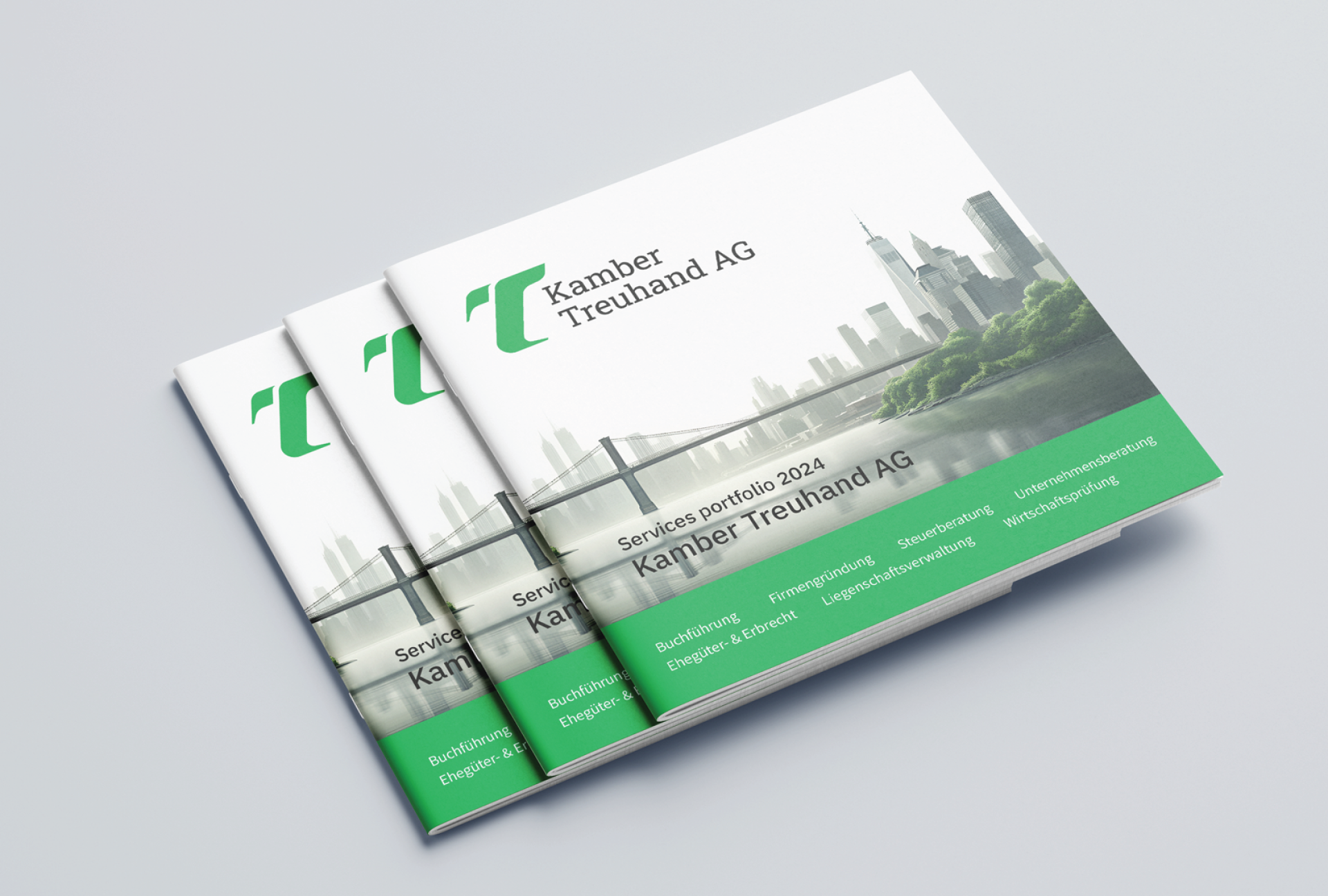
For Kamber Treuhand AG, an established trust company from Eastern Switzerland based in Wattwil and located in Wil, we modernized the entire branding and sharpened it for a wider, younger target group.
Kamber Treuhand has been known for decades as a reliable partner for trust services, accounting, taxes and auditing. However, the visual identity looked noticeably older than the actually young, digital team.
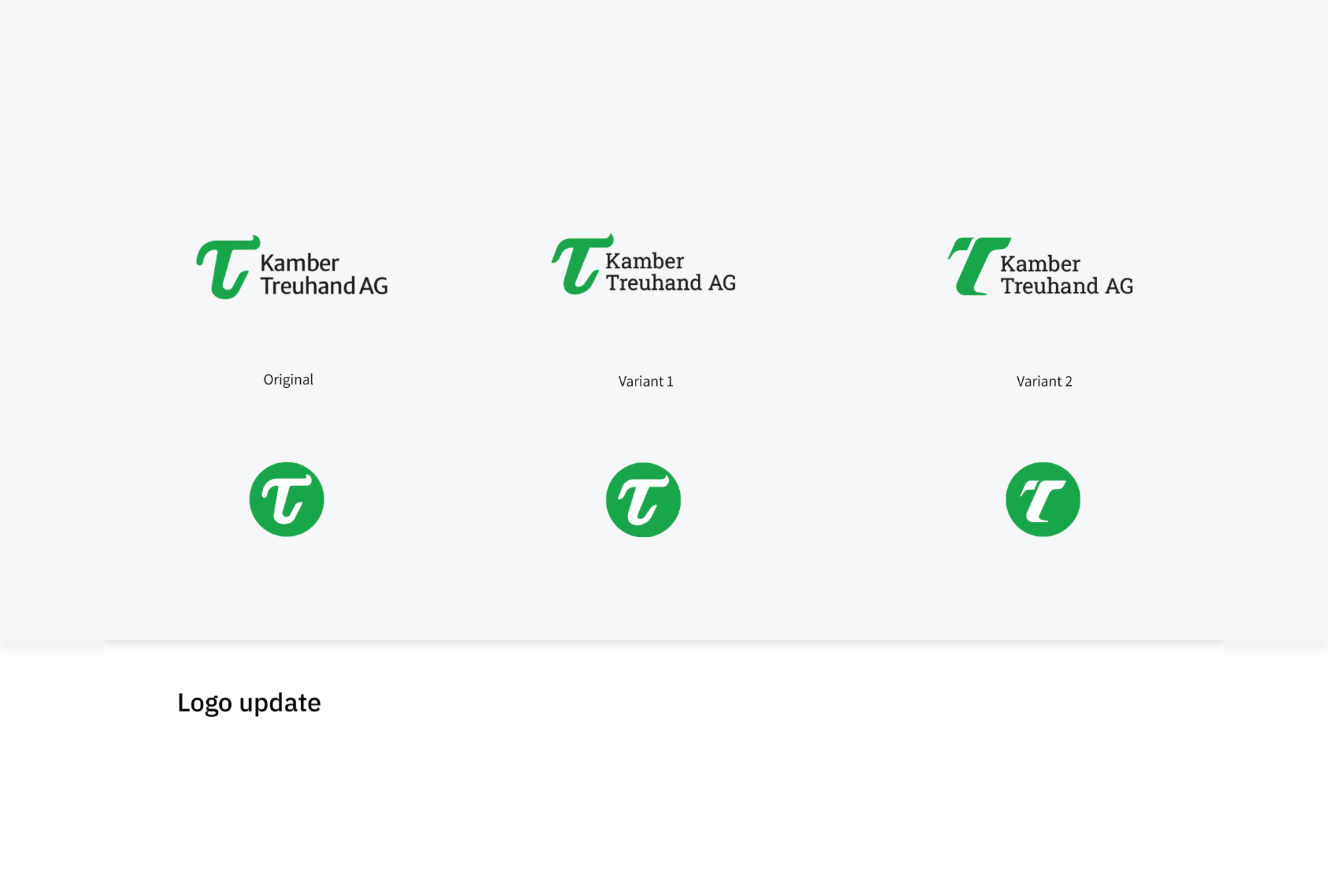
The existing logo with its distinctive T and green color had recognition value, but conveyed little dynamism and primarily appealed to a rather traditional clientele. The challenge:
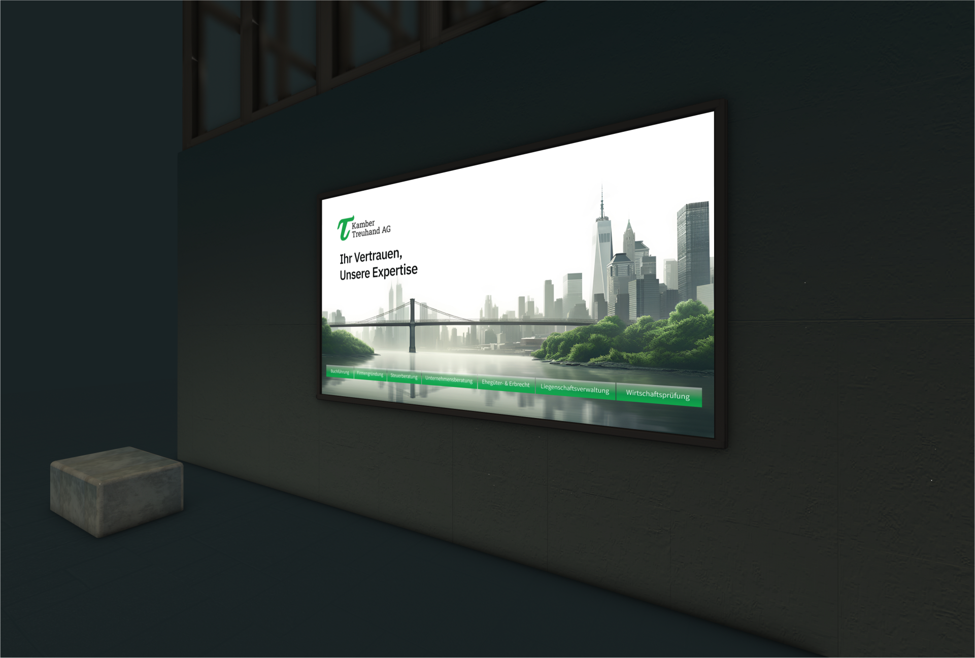
The brand needed to become more modern, fresher and visually consistent without losing the established trust base and high recognition value. At the same time, the branding also needed to work on the website and at trade fair appearances.
We started with a structured questionnaire survey to clarify values, tonality, target groups and emotional brand cores. Based on this, we developed an updated branding that builds on the existing look but takes it straight to the next level.
Core building blocks:
- New, expanded color palette based on familiar green
- Two logo styles, one more modern, one closer to origin, with integrated company name
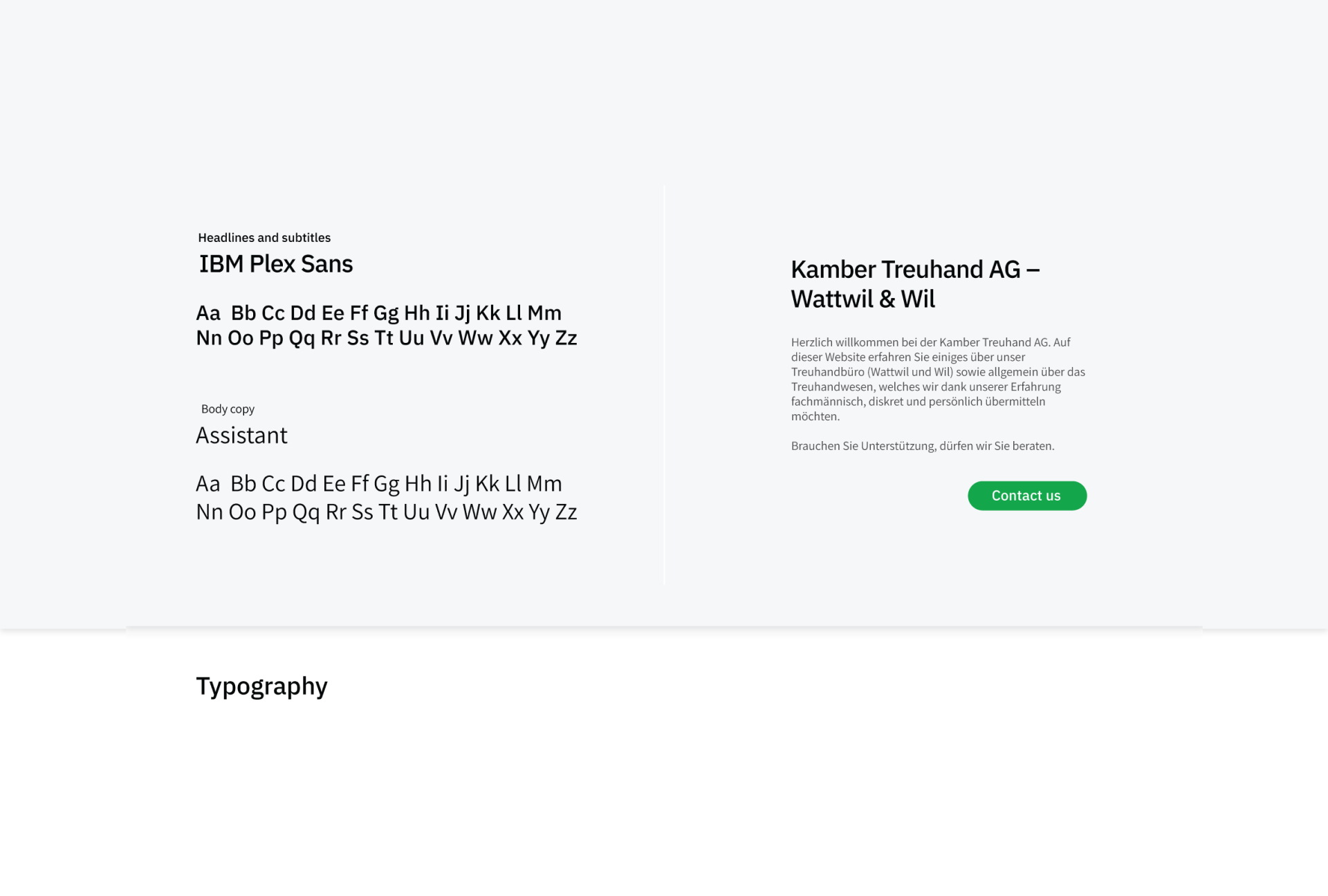
- Elaborated branding kit with color definitions, typography, logo variants and application examples
- Transfer of branding to a UI kit for the website including mockups for digital and analog touchpoints
Today, Kamber Treuhand appears visibly contemporary without denying its origins. The company can address different target groups more clearly and position itself more modernly in the competitive trust market.
- Uniform presence across website, documents, trade fairs and events
- Stronger visual fit for digital services
- More relevance for younger and entrepreneurial target groups

- Old-looking logo despite modern services
- Inconsistent visual presence across channels
- Low appeal for younger target groups
- Modernized logo with familiar T and clear word mark
- Consistent branding thanks to clear guidelines and UI kit
- Fresh, trustworthy appearance that appeals equally to existing and new customers
Is your project our next?
Tell us what you're up to. We'll tell you within 30 minutes what's possible and whether we're the right person for it.
More Case Studies


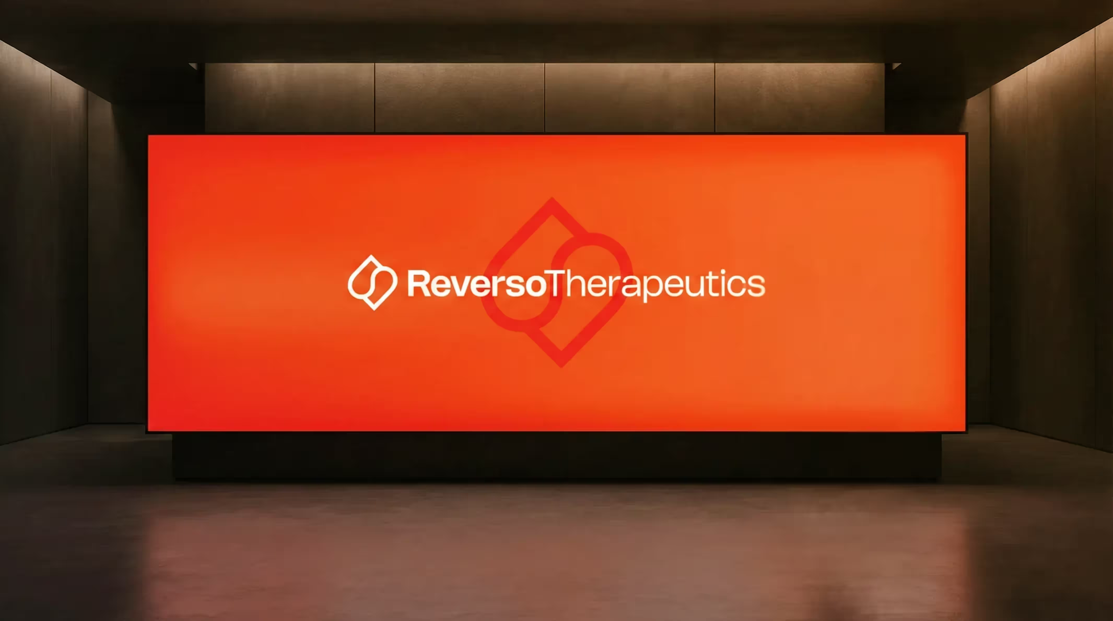
Rebranding for a Geneva University Pharma Spin-off
For Reverso Therapeutics, a spin-off of the University of Geneva in the field of next-gen anticoagulation, we developed a precise and recognizable branding. The result strengthens their position with researchers, partners and investors.
These Are
Your Next Steps
In the Projekt Check, we discuss your project and your goals.
We define the best solution and plan implementation, effort and time frame.
We realize your vision, support you all the way to go-live and beyond.
Take the first step towards implementation.
In 30 minutes, we will review your project, provide personal advice and show you the path from vision to implementation.
